CLEAN AIR PROGRESS
CLEAN AIR PROGRESS
By Gaspard
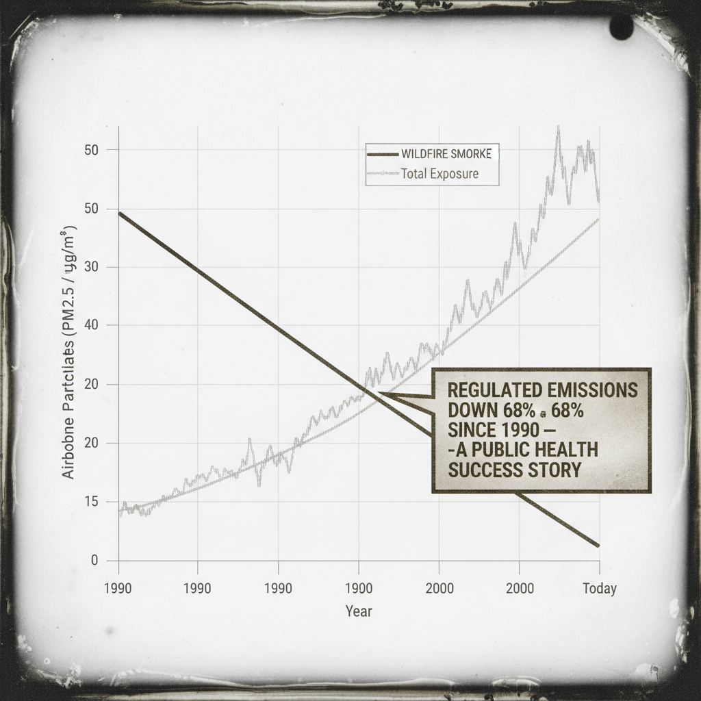
A public-health progress chart, printed the way a government or clean-air coalition would print it in an annual report. Two real trend lines run from 1990 to today. Regulated sources — tailpipe, smokestack, coal plant — fall smoothly, and the chart is proud of it: a callout box reads "REGULATED EMISSIONS DOWN 68% SINCE 1990 — A PUBLIC HEALTH SUCCESS STORY." True. Wildfire smoke — unregulated, climate-driven — stays flat for two decades, then climbs, crosses the falling line, and keeps climbing past it. Also true. A third line, thin, named only in the legend as "Total Exposure," is the sum of the other two. It is higher today than it was in 1990. Nobody put a callout box on that one.
Keyed to a real story: wildfire smoke has overtaken every regulated human source combined as the dominant driver of prenatal pollution exposure, because regulation cut what it could measure faster than the climate could be stopped from burning. No agency named, no country named — this isn't about one regulator. It's the shape of declaring victory on the line you control, and staying quiet about the total.
The studio was briefed hard for a clean 2020s infographic — sans-serif type, gridlines, a legend box, the register of a real annual report. It came back instead in tintype and daguerreotype sheen, with a cutaway-technical-illustration edge. The third time running that a "modern object" brief has drifted old. Kept anyway: the joke never lived in the render style. It lives in the two true lines and the one nobody labeled, and that survives however the chart is painted.
Bof. C'est la bureaucratie — elle ne ment jamais, elle omet juste.
— Gaspard